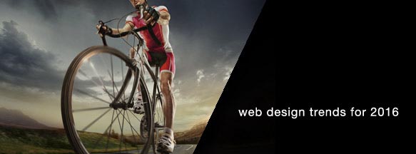
2015 has come and gone and 2016 is just getting started. Looking back at what we predicted for 2015, it seems like we were a little ahead with many of those trends just starting to pick up now.
While many are stating the fact that there doesn’t seem to be much variety in web design anymore, we are seeing a few trends that may help differentiate you from your competitors and make individual statements about your brand.
Monocolour Minimalism
Last year we suggested some websites would using a minimalist approach by choosing a single primary colour for key parts of the site. Often associated with the Swiss Design movement in the 50s and 60s, this technique makes for bold websites where the focus is clearly on the textual content. Iconography will also feature prominently and images while monochromatic will be clear and give the site a structured look.
Card/Tile-Based Design
We expect this trend to continue into 2016 with more innovation and interesting effects with how cards respond to user interaction. Full page card designs are popular for displaying a blog or product range, while some sites opt for full-width panels with one or two rows of cards that are often images or icons with a heading or key statement. Explanatory text can then be displayed using CSS-based animation by flipping, sliding, fading or expanding content areas which allow for an interesting user experience.
SVG Graphics
We first discussed this in 2014 as a method for using animation without Flash. SVG as a vector graphic format allows for fluid animations such as rotating, resizing or morphing from one shape to another. With the retirement of IE6 it is no longer necessary to use VML fall-backs in JavaScript allowing for the animations to be done purly in CSS.
Another interesting method is to convert the SVG graphic to an icon font where the character graphic can be manipulated like any other piece of text using CSS or JavaScript.
Hand Writing on Your Wall
To create a more personalized and warmer feeling and differentiate their website from their competitors, site owners are increasingly requesting handwritten fonts for headings and key statements. Using a non-standard font can draw the visitors attention to a statement or aid in navigating large blocks of text, particularly on long-scroll pages.
Mobile First
With average mobile usage sitting at 40% globally and 30% in Australia, we expect the priority to finally shift to thinking of how a website looks on mobile first rather than the desktop. While the actual split between mobile and desktop users will vary greatly depending on the audience or industry, we expect mobile usage to increase overall due to a combination of better technology, more sites supporting mobile browsing and providers offering better data rates.