The new year is now behind us, and we’re looking forward and thinking about what innovations and ideas to expect for the rest of the year. It is safe to say that by the end of 2020 mobile devices will clearly be the preferred browsing platform, as desktop and laptop usage continues to fall as a percentage of visitors’ devices. This will continue to be the case as sites improve their mobile usability and web consumers choose their mobiles as their primary device.
Due to this increasing need to focus on mobile users, the following trends in design are about embracing what works for mobile and bringing those to the desktop.
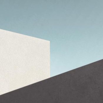
Minimalism for Mobile
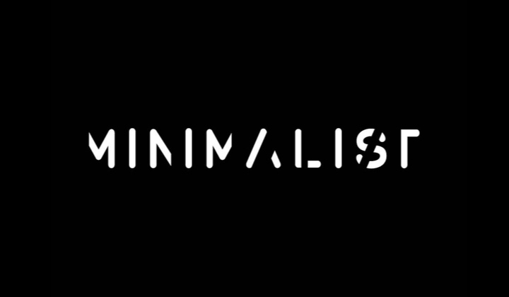
Minimalism has been a popular web design trend in recent years such as the flat coloured tiles of Windows 10 to Google’s Material Design that has been gradually implemented throughout their app suite. Minimalism lends itself to cleaner, clearer user interfaces, which improves audience experience and make content easier to comprehend. Additionally, minimalism often helps with readability by reducing design clutter and emphasising white-space.
Minimalism as an art form came to prominence mid-2oth century in abstract geometric art, architecture, industrial design and commercial typography. The less is more philosophy was greatly influenced by minimalist Japanese aesthetics and the concept of “empty space”.
In modern web design minimalism has been embraced as a guide for providing usable interfaces on mobile devices, given the constraints of screen size and download speeds. Navigational elements such as the “hamburger” icon and off-screen menus will increasingly be carried over to the desktop rather than being a mobile-only view.
Utilising space effectively is also important for users with large screens. Rather than introducing additional elements, being able to scale and work with the available space can find the balance between usability while still seeming to fill the screen.
Working within the constraints of mobile devices will continue to be important over the coming years even as manufacturers introduce new classes of mobile devices with folding screens to increase viewing space.
With the continuing growth in mobile utilisation, presenting a website that is optimised for mobile usage is increasingly important, as users are most likely to look elsewhere than shift to their desktop when using a site that does not present well or is unusable on mobile. Goggle and to a lesser extent other search engines also give preference to websites that perform better on mobile devices and will warn users where the website they are potentially going to visit is not mobile optimised.
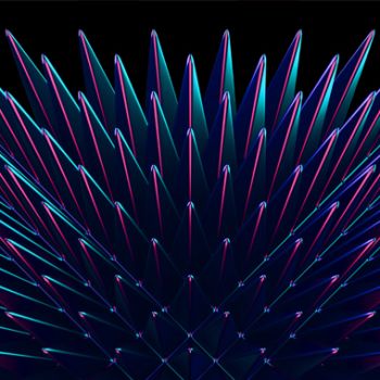
Dark Mode & Neon Glow Design
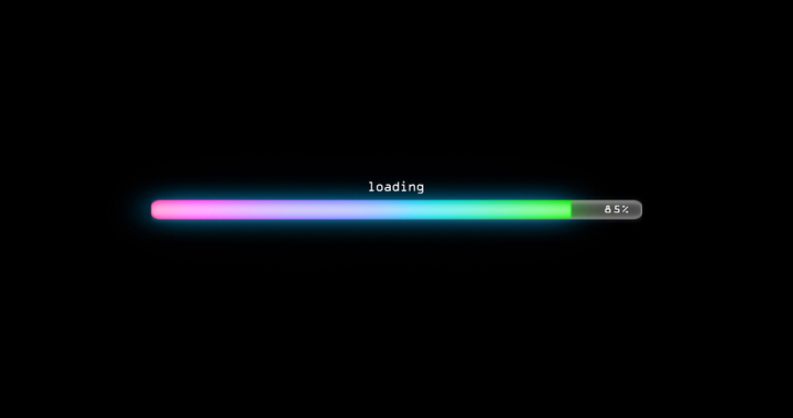
Dark mode was first introduced to consumers with the release of Mac OS “Mojave” but has it’s roots in the programming community who have had the option of choosing a light on dark theme to reduce eye strain when coding for long hours (particularly late at night).
Using dark backgrounds can make the colours more vivid and draw focus to key elements such as action buttons or highlighted text. When combined with neon glow for a futuristic asthetic the contrast between the background and the bright glowing colours can give the site a 3-dimensional depth that’s not possible with a black on white “printed paper” design.
A similar design concept that is becoming popular is using duotone colours. A duotone site is predominately black and shades of a single colour. This leads to a very striking design that can be particularly effective for brands that use predominately one colour.
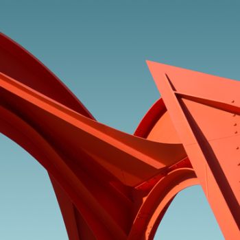
Vector Art & Pseudo 3D
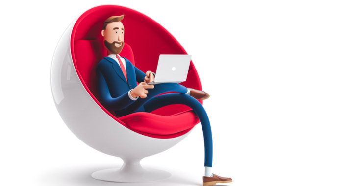
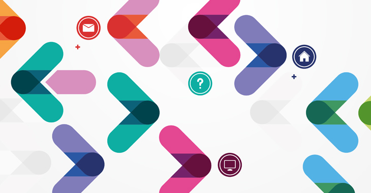
While there will always be a place for photographs in a website particularly for locations, products or a business’s key people, designers are now often turning to vector style graphics. Iconography is becoming increasing sophisticated moving from simple icons to denote functions to complex animated line art and hand-drawn style graphics. Also in fashion are colourful clip-art style abstract illustrations that can often be used in place of photographs. Expect to see companies display their products as illustrations or a blend of photograph and either line and solid graphic shapes.
Pseudo 3D and isometric projections are popular design elements that take inspiration from retro games. Utilising simple abstract shapes that can present 3D-like displays to present information in novel unique ways.